Google is a major source of traffic for most businesses. Thus, it is critical for anyone pursuing business seriously to rank well on Google.
While no one knows what all the factors go in determining Google ranking, it is a well-known fact that page speed is one of the primary ones. Page speed affects load time and meddles with user experience, something Google gives a lot of weight to and has even mentioned.
For a user, there's absolutely nothing as annoying as a slow website. They're an impatient bunch with a very short attention span. And they don't have the time or tolerance for a website that doesn't respect that. And Google knows it.
And if that wasn't enough, as per Google, there's a direct relation between conversion rates and page load time.
Speed matters.
What is Google PageSpeed Insight?
It is a free-to-use tool by Google that gives you a lot of insight and performance suggestions for improving the page load time. PageSpeed Insights analyzes the content of a web page and then generates suggestions to make that page faster. This is done by taking into account many different reports and analyses using Google Lighthouse, details of which can be found here.
Does this PageSpeed also give reports for images?
Yes.
Google PageSpeed generates a report for the entire page. And since images are a part of the page, those get included in the report as well. And now, with the use of Lighthouse, it gives some stellar suggestions for improving the image-related assets on your website.
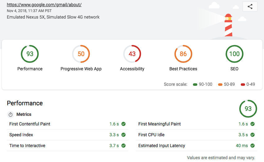
Alternatively, you can check out ImageKit's website analyzer, which is built specifically to show you the performance of your images and videos.

But why images?
Most often, images are the lowest hanging fruit in your goal towards overall page performance improvement. Image optimization is now available as a standard from a lot of tools like ImageKit. And you can solve these problems, that too, without any extensive changes from your end in your code. So, it’s usually the first and easiest thing to provide a solution for.
Download cheat sheet
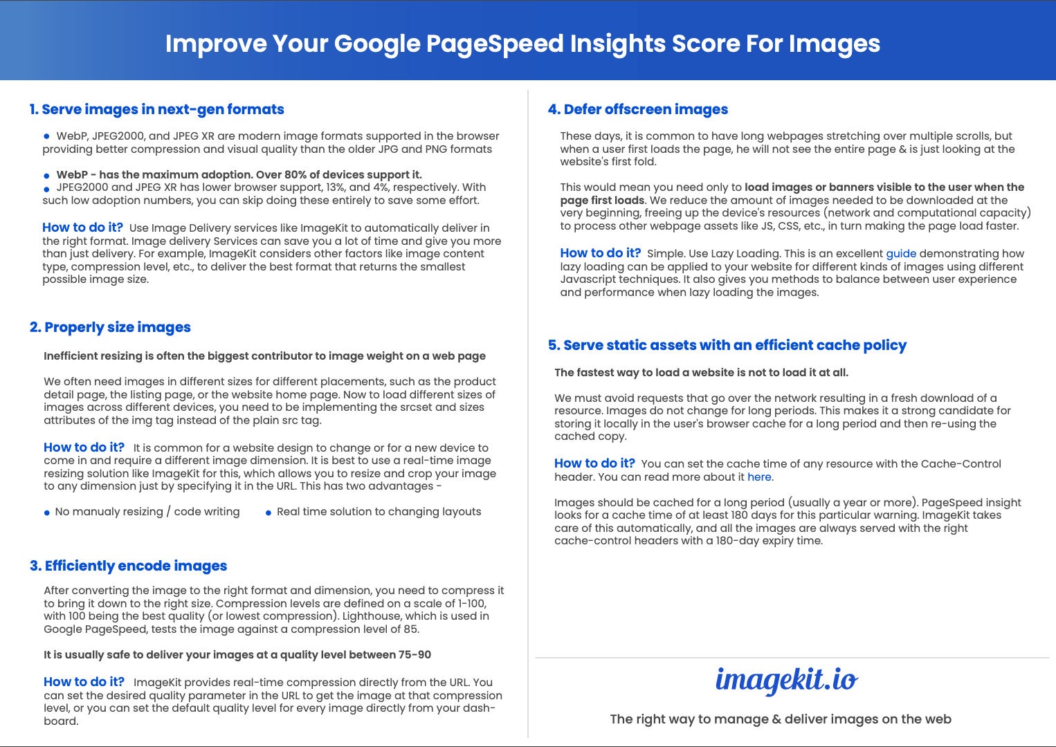
What are the issues with images reported by Google?
As of the date this article was published, Google PageSpeed Insights reports 5 issues with images on the website. Let’s have a look at them and how you can solve each using different techniques.
1. Serve images in next-gen formats
WebP, AVIF, JPEG2000, and JPEG XR are modern image formats supported in the browser providing better compression and visual quality as compared to the older JPG and PNG formats. Higher compression while maintaining the visual quality means your images consume lesser data over the network and are downloaded faster.
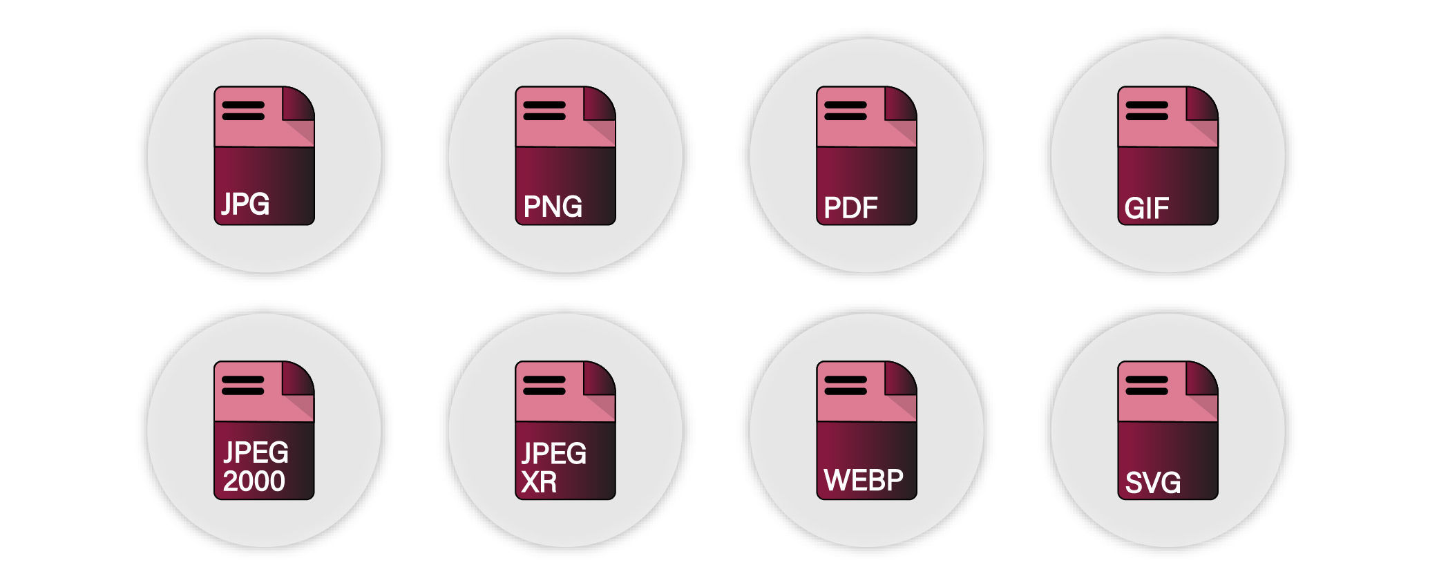
Amongst these formats, WebP is the one that has seen the maximum adoption. With Firefox also adopting it, it is now supported in over 80% of devices.
However, both JPEG2000 and JPEG XR have not really caught up with browser support at 13% and 4%, respectively. JPEG2000 is supported in Safari, whereas JPEG XR is supported in IE browsers. With such low adoption numbers, you can skip doing these entirely to save some effort. Google’s PageSpeed tool also does not report cases where JPEG2000 and JPEG XR are not used.
How to do it?
You can use ImageKit to deliver the images in the right format automatically. It supports conversion to next-gen image formats like AVIF and WebP.
Learn more about how ImageKit can serve images in AVIF format on the same image URL, without you needing to change anything in the backend.
Additionally, ImageKit also takes into account other factors like image content type, compression level, etc., to deliver the best format that returns the smallest possible image size.
2. Properly size images
Once the image has been converted to the right format, it is also important to bring it down to the right dimensions that are actually required on the page.
An image clicked using a DSLR camera could be more than 5000×3000 pixels, which is not what you need on your website.
Suppose, you probably need this image on three different pages on your website, each with a different size requirement -
- Product detail page - 1000×1000px.
- Product listing page - 400×400px.
- Website home page - 100×100px.
So, you must resize and crop your original image, which measured about 5000×3000px to the above three sizes.
How to do it?
It is best to use a real-time image resizing solution like ImageKit for this, which allows you to resize and crop image to any dimension using URL parameters. This has two advantages -
- You do not have to do this resizing manually or write any code of your own to do it.
- A real-time solution allows you to quickly adapt your images to changes in layouts.
For example, the original image is 1280×853px.
https://ik.imagekit.io/ikmedia/woman.jpg
To get a 200px wide image, use tr=w-200 query parameter
https://ik.imagekit.io/ikmedia/woman.jpg?tr=w-200
To resize image to 400 width and 200 height, you can use tr=w-400,h-200
https://ik.imagekit.io/ikmedia/woman.jpg?tr=w-400,h-200
If you have a responsive website, and are wondering how to load the correct size of an image across different devices, then you should consider implementing the srcset and sizes attributes of the img tag instead of the plain src tag. These new attributes allow you to provide the browser with a list of image URLs and the their sizes. The browser then automatically loads the most appropriate image resource from the available list based on actual device width.
It is common for a website design to change or for a new device to come in and require a different image dimension. Having a real-time image resizing solution ensures that you easily adapt to such a situation by just changing the dimensions specified in the URL.
3. Efficiently encode images
After converting the image to the right format and dimension, you need to compress the image to bring it down to the right size as well. That is, you need to compress an image without degrading its perceived visual quality.
Typically, compression levels are defined on a scale of 1-100, with 100 being the best quality (or lowest compression). Lighthouse, which is used in Google PageSpeed, tests the image against a compression level of 85.
It is usually safe to deliver your images at a quality level between 75-90. At these levels, the tradeoff between image size and image quality is acceptable, and the visual degradation would be imperceptible to the human eye. Adjusting the compression level can bring down the image size significantly, therefore, allowing for faster downloads.
How to do it?
ImageKit provides real-time compression directly from the URL.
For example, you can set get an image at quality 20.
https://ik.imagekit.io/ikmedia/woman.jpg?tr=q-20
Reducing the quality of an image also reduced its file size. This is useful if you want to load low quality placeholder image while original image is lazy loaded in the background.
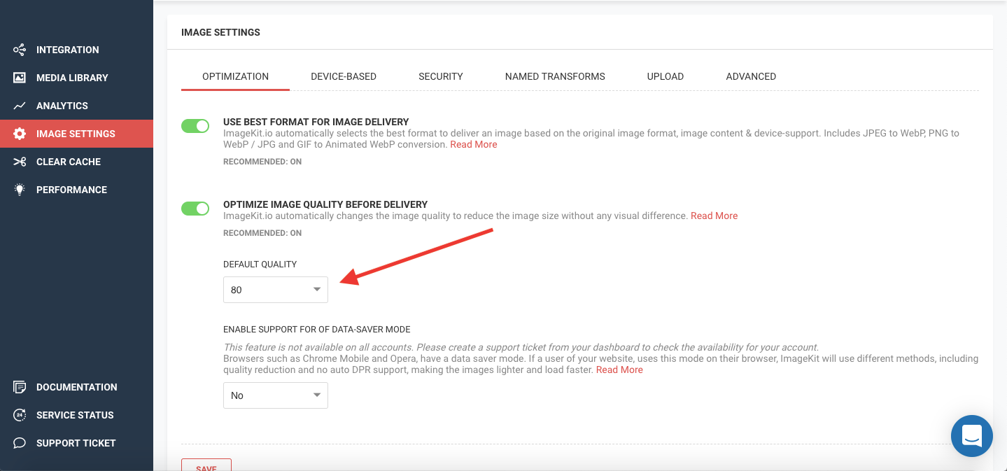
In ImageKit you can set the default quality level for every image directly from your dashboard.
4. Defer offscreen images
It is common these days to have long webpages stretching over multiple scrolls. A typical e-commerce product listing page has hundreds of products on the same page, each with an image or two of its own. This means a page could load somewhere between 100-200 images, which roughly translates to over 1MB of images on the page.
Though, when a user first loads the page, he is not able to see the entire page. He is just looking at the first fold of the website that fits on his screen. This would mean just the first 10-20 products or banners are visible to the user when the page first loads. Therefore, the remaining 80-100 images need not be loaded until the user starts scrolling down the page.
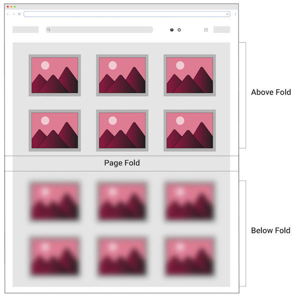
This reduces the number of images needed to be downloaded at the very beginning, freeing up the device’s resources (network and computational capacity) to process other webpage assets like JS, CSS, etc., in turn making the page load faster.
How to do it?
This is an excellent guide demonstrating how lazy loading can be applied to your website for different kinds of images using different Javascript techniques. It also gives you methods to balance between user experience and performance when lazy loading the images using some of the transformations provided by ImageKit.
Apart from what is mentioned in the linked guide above, modern browsers also intend to support lazy loading of images using the “loading” attribute. This will probably be available starting Chrome 76 for desktop devices. Till that comes out, the Javascript techniques mentioned in the guide will serve you well across browsers.
5. Serve static assets with an efficient cache policy
The fastest way to load a resource is to leverage browser cache and avoid network roundtrip.
Images do not change for long periods. A black Adidas shoe will look the same for all users for months to come. This makes it a strong candidate for storing it locally in the user’s browser cache for a long period of time, and then re-using that locally cached copy instead of downloading the image again and again over the network.
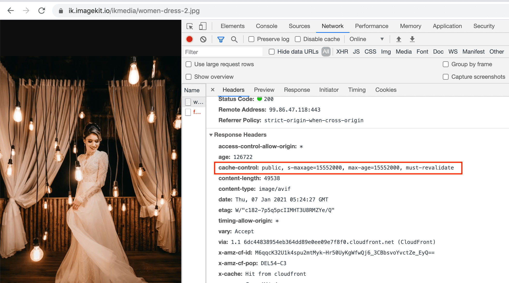
You can set the cache time of any resource with the Cache-Control header. You can read more about it here.
Images should be cached for a long period of time (usually a year or more). Though, after having tried and tested with different cache times, PageSpeed insight looks for a cache time of at least 180 days for this particular warning. This warning would come up for resources with cache-time less than 180 days.
ImageKit takes care of this automatically, and all the images are always served with the right cache-control headers with a 180-day expiry time.
FINAL THOUGHTS
While you are spending hours and days building the perfect website for your business, don't forget the images you display on it have a direct impact on your user experience and page load speed.
Optimizing your images and providing the best user experience will give your website the edge it needs above the competition.


