According to the data from HTTP Archive, images make up nearly 64% of an average web page in terms of load size. From e-commerce to fashion, news and travel websites, images are a critical component of any website or mobile app these days. Thus making image optimization not just an afterthought but the need of the hour. Using optimized images will not only help us deliver an engaging yet fast visual experience but also save up those extra kilobytes of data.
Image optimization techniques to consider when using images on a website or mobile app.
1. Use correct image dimensions
You should always use an image that is sized exactly or close to the size that has to be finally rendered. Using an image that is larger than what is required is by far the most common and taxing mistake that can be seen on websites and mobile apps.
Consider a case where the final image that has to be rendered is 200px wide and 300px high. Ideally you should load an image that fits exactly in this container, i.e. 200 px by 300px. If you were to load an image that is 800px by 1200px in this case and let the browser or app resize it for you, then you are loading about 10-15 times the data than what is actually required.
This is more important for e-commerce applications where lots of product thumbnails are shown on one page. Sizing the thumbnails right can reduce the page load size significantly.


2. Use the correct image format
As discussed in one of our previous posts, there are a lot of image formats out there and JPEG, PNG, and GIF are the most commonly used ones.
A relatively new image format — WebP — tries to encapsulate the good things from each of the three aforementioned formats into a single image format while providing better compression ratio.
A common mistake is the use of PNG images for natural scenes and photographs. In such cases, a JPEG or a WebP image would be a lot lighter than the PNG image, and yet look exactly the same.
Using the correct format can have a great impact on reducing the bandwidth consumption by images.


3. Compress your images
Even after selecting the correct image dimension and format, it is possible to further reduce the size of the image via compression.
One method of compression is by removing all the unnecessary metadata associated with the image without changing the image quality. This metadata can be safely discarded while displaying the image. This method is called lossless compression and is a must before using images on a website or an app.
The other method, lossy compression reduces the quality of the image to get a smaller size. However, the human eye cannot distinguish between the original uncompressed image and an image at a slightly reduced quality. Hence, on a scale of 100, it is often safe to reduce the image quality to 80-90. Doing so often brings down the size of the image to 20–25% of the original.


4. Use progressive JPEG
This image optimization is tuned towards increasing perceived performance on the page and may come with slightly higher bandwidth consumption.
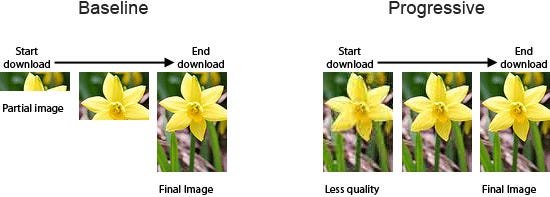
One way to render a JPEG image is to start from the top, rendering each row at a time, and moving towards the bottom. This is called the baseline loading pattern and doesn’t do well with the users who have to wait to get a glimpse of the entire image.
The other way is to render a low-quality pixelated full image, and then gradually keep on adding more pixels and information to the image. This kind of loading is called progressive loading and is available for JPEG images.
Using progressive JPEGs on your website and app will have a significant improvement in terms of user experience. The user gets visual feedback quicker as compared to the top-down loading method.

5. Optimize image delivery
Even if you've followed all the steps above and optimized your images, the work is incomplete. There's one more, one final thing to do. Delivering the image. After all, an optimized image is no good if it cannot be delivered quickly.
Ensure that your image servers can handle potentially 3-4x of your regular traffic to account for traffic spikes.
Always deliver images with proper caching headers so that the user’s device can use cached versions of the images. This saves the client’s device from downloading the entire image content if it is not modified as compared to the copy saved with the client’s device.
You can even consider setting up a caching layer on your serve-side to serve static content like images directly from the cache instead of going to your application servers.
If your traffic is global or if your image servers are located far away from your actual users, consider using a Content Delivery Network (CDN). In simple terms, a CDN is a global network of servers that can deliver images (or other static content) from a server closest to the geographical location of your user.
Closer the server, faster the response time.
You can find a demonstration of the above on 5 image optimization examples.


